Mobile View Controls: Make Every Email Work on Small Screens
Overview
You can now fine-tune how your emails look on mobile devices, with new Mobile View Controls in the Email Builder.
These controls let you adjust how each block displays on mobile, without changing the desktop design. This means every email can now be crafted for the small screen while keeping the desktop design intact.
🌟 What's New
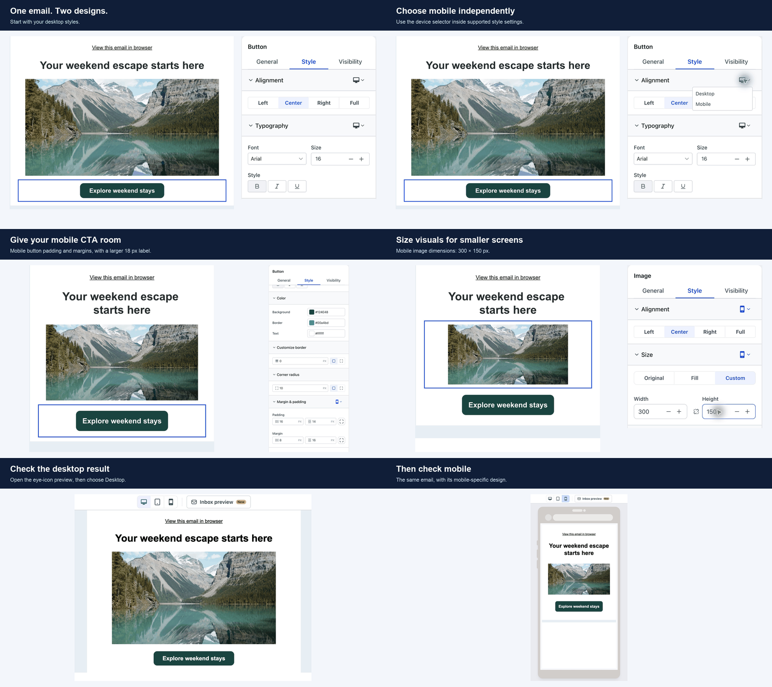
With Mobile View Controls, you can preview and adjust how every part of your email displays on mobile.
👀 Preview on the Fly
You can now switch between desktop and mobile views inside the email builder. This lets you see exactly how your email will look on a phone, while you're still designing it.
🖼️ Image Controls
For images, you can change the width, alignment, and border radius on mobile. You can also use the same image at different sizes for mobile and desktop, making sure visuals look sharp without taking up unnecessary space on smaller screens.
📝 Text Controls
For text blocks, you can adjust the font size and line height for mobile, so your content stays easy to read without overflowing or needing to zoom.
🔘 Button Controls
For buttons, you can adjust the width and alignment on mobile. This makes sure your buttons remain large enough to tap, easy to find, and perfectly positioned for small screens.
📦 Container Controls
For containers, you can adjust the width and padding for mobile, so your layout stays organized, balanced, and free of awkward spacing.
🧱 Control Stacking & Layout
You can now stack and organize sections and rows so they display cleanly on mobile. Content that spreads across the desktop view can be arranged vertically for mobile, without needing a separate design.
🧩 Row-Level Controls
At the row level, you can adjust the layout for mobile, including changing row stacking and how individual elements align. This helps maintain a clean, professional design even when the screen gets smaller.
🎯 Fine-Tuning with Sliders and Presets
For all controls, you can use sliders to fine-tune values or choose from preset options. The interface is intuitive, letting you make quick adjustments with visual feedback.
🛠️ How to Use
- Open the email builder.
- Select any block, row, or container in your email.
- Switch to the mobile view using the view toggle at the top.
- Use the controls in the right panel to adjust width, font size, padding, alignment, or layout for mobile.
- Preview your changes in real time to see how the email will look on a phone.
- Save your email, and the mobile adjustments will apply automatically.
🎯 Why It Matters
- One Design, Two Experiences: Your emails can now look great on both desktop and mobile, without creating two separate versions.
- Less Guesswork: Preview your email on mobile as you design, so you know exactly what your audience will see.
- No Rebuilding: Mobile-specific adjustments apply automatically, saving you time and effort.
- Better Engagement: Emails designed for mobile are easier to read, click, and act on, leading to higher open and click rates.
💡 Good to Know
- Mobile settings override the desktop settings only for mobile devices, so the desktop view stays the same.
- Use the same image at different sizes for mobile and desktop to keep load times fast and visuals clear.
- Padding and alignment adjustments on mobile apply only to the selected block or row.
- Your desktop layout remains unaffected by any changes made in mobile view.
- You can test the mobile view at any point during your design process to catch and fix display issues early.
Learn more about mobile controls: Mobile view controls help article